Africa is almost the same size as Russia, the US and India combined
Main points
- Africa covers about 30.3 million square kilometres
- Russia, the US and India nearly fit within it
- Traditional maps can make Africa look much smaller
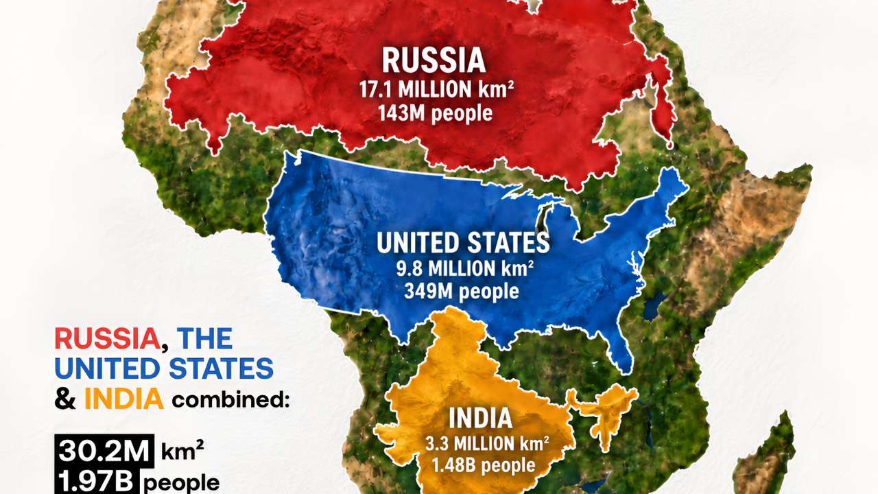
Africa is much bigger than it appears on many familiar world maps. At roughly 30.3 million square kilometres, the continent is almost the same size as Russia, the United States and India combined.
Russia covers about 17.1 million sq km, the United States about 9.8 million sq km and India about 3.3 million sq km. Together, they cover roughly 30.2 million sq km, slightly less than Africa. The CIA World Factbook similarly puts Africa's continental landmass at just over 30 million sq km.
The comparison is striking because Russia is the world's largest country, while the United States and India are themselves among the largest. Yet all three can be placed within an outline of Africa at roughly their true relative sizes.
There is a major difference when it comes to population. Africa has around 1.58 billion people in 2026, based on the UN's World Population Prospects 2024 estimates and projections. India alone has around 1.48 billion people, while the United States has roughly 350 million and Russia about 140 million. Together, the three countries have close to 2 billion people, considerably more than Africa. The UN's latest population dataset provides estimates and projections for 237 countries and areas through 2100.
RECOMMENDED FOR YOU
Canada and Mexico are the closest foreign countries to most of the United States
Why Africa often looks smaller
Part of the surprise comes from the maps many people grew up seeing.
The Mercator projection, developed in the 16th century for navigation, stretches areas farther from the equator. This makes northern countries such as Russia and Canada, as well as Greenland, appear much larger relative to places closer to the equator.
Africa is one of the clearest examples. On some Mercator maps, Greenland can appear almost as large as Africa. In reality, Africa is about 14 times larger than Greenland.
The difference has attracted renewed attention after the UN General Assembly backed wider use of the Equal Earth projection in September 2026. Unlike Mercator, Equal Earth preserves the relative area of continents, giving a clearer picture of Africa's enormous size.
So the comparison with Russia, the United States and India is more than a geographical curiosity. It helps correct a common impression created by traditional world maps: Africa is the world's second-largest continent, and its true scale is easy to underestimate when looking at a Mercator map.